

Table of Content
Introduction to CSS Flexbox.
Basics and terminologies used in CSS Flexbox.
CSS Flex Container
CSS Flex items
Alignments properties associated with CSS Flex container:
Flex-direction
Flex-wrap
Flex-flow
Justify-content
Align-content
Align-items
Perfect centering with CSS Flexbox.
Sizing and positioning associated with CSS Flex items:
Order
Flex-grow
Flex-shrink
Flex-basis
Fex
Align-self
Conclusion.
Introduction to CSS Flexbox
When learning Front-end languages, Html and JavaScript can be quite fun. However, as Front-end developers, we can all agree that seeing our webpage beautifully designed and responsive gives unmatched satisfaction.
CSS flex-box layout is a particular way to specify the layout of HTML pages. The flexbox module aims at providing a more efficient way to lay out, align and distribute space among items in a container.
Before the Flexbox Layout module, there were four layout modes:
Block, for sections in a webpage
Inline, for text
Table, for two-dimensional table data
Positioned, for the explicit position of an element
The CSS flexbox layout allows us to design a responsive layout structure without the use of float or positioning.
Basics and Terminologies used in CSS Flexbox
CSS Flex container and Flex Items
To start using the CSS Flexbox property in your CSS file, you must first define a flex container. The flex container is a box that holds the flex items. Styling can be done on the container and the flex items.
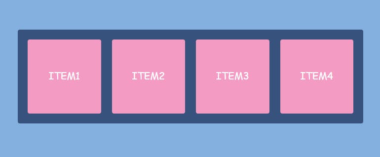
Below is an example of a flex container containing four(4) flex items
<div class ='flex-container'>
    <div>item 1</div>
    <div>item 2</div>
    <div>item 3</div>
    <div>item 4</div>
</div>

Since flexbox is a whole module and not a single property, it involves a lot of things including its whole set of properties. Some of them are meant to be set on the flex container ( which is the parent element) whereas the others are meant to be set on the flex items (which are the children).
Alignments properties associated with CSS Flex container
The flex container created in the HTML is made flexible by setting the display property in CSS to the value flex.
.flex-container{
    display:flex;
}
As previously stated, some of the flexbox properties would affect how the items are positioned in the flex container.
The following are CSS Flexbox properties that affect how flex items are positioned in the Flex container
Flex-direction
Flex-wrap
Flex-flow
Justify-content
align-content
align-items
Flex-Direction
The flex-direction property defines how items are arranged in the container. They can be arranged either vertically or horizontally.
The items in a flex container can be arranged in the following ways
row
row-reverse
column
column-reverse
Row
Setting the flex-direction property to row arranges the items in the container horizontally in order of first to last item. This is the default setting for the flex property.
.flex-container{
display: flex;
flex-direction: row
}
Row-reverse
The row-reverse property arranges the items horizontally. However, it is arranged from the last to the first item in the container.
.flex-container{
    display:flex;
    flex-direction: row-reverse;
}

Column
Setting the flex-direction property to column stacks the flex items vertically from first to last.
.flex-container{
    display: flex;
    flex-direction: column;
}

Column-reverse
The column-reverse property arranges the items vertically. However, it is arranged from the last to the first item in the container.
.flex-container{
    display: flex;
    flex-direction: column-reverse
}

Flex-wrap
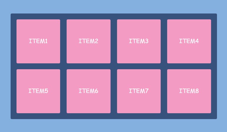
By default, flex items will all try to fit onto one line. You can change that and allow the items to wrap as needed with this property. The 'wrap' value specifies that the items will wrap if the items can not fit in one row. This way, the flex items will wrap onto multiple lines inside the flex container.
The Flex-wrap property can be assigned three different values. they are as follows
nowrap(default): all flex items would be on one line
wrap: flex items will wrap onto multiple lines from the first to the last item
wrap-reverse: flex items will wrap onto multiple lines from the last to the first item
.flex-container{
display: flex;
flex-wrap: wrap || nowrap || wrap-reverse;
}
Flex-flow
This is a shorthand for setting the flex-direction and flex-wrap properties. The flex-flow property can be assigned two different values. the first value represents the flex-direction. the second value represents the flex-wrap.
.flex-container{
display: flex;
flex-flow: row wrap;
}
Any of the flex-direction and flex-wrap values can be used together for the flex-flow property.
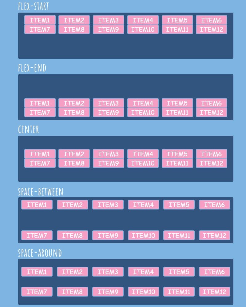
Justify-content
The justify-content property is used to align the flex items. The justify-content property provides horizontal alignments to the items. It may have one of the following value
flex-start: items are packed toward the container’s left side (it’s the default value)
flex-end: items are packed toward the container's right side
center: items are placed in the center
space-between: items are evenly distributed in the line (the first item is on the left, the last item on the right)
space-around: items are evenly distributed in the line with equal space around them. Note that visually the spaces aren’t equal since all the items have equal space on both sides. The first item will have one unit of space against the container edge, but two units of space between the next item because that item has its spacing that applies.
space-evenly: items are distributed so that the spacing between any two items (and the space to the edges) is equal.
.flex-container{
    display: flex;
    justify-content: flex-start | flex-end | center | space-between | space-                                                    around | space-evenly
}

Align-content
Just like the justify-content value, align-content is used to align the flex items in a flex container. However, the items are aligned vertically.
This property only works when these conditions are met
The 'wrap' value should be applied to the container
The flex container should have a greater height than the lines of the flex items
The align-content has similar values as the justify-content with slight differences. The following are values of align-content:
Flex-start: The flex-start value displays the items at the top of the flex container.
Flex-end: The flex-end value displays the items at the bottom of the flex container.
Center: The items are arranged at the center of the flex container.
Space-between: The items are evenly distributed i.e the items are displayed with equal space between them. The first line of the item is at the start(top) of the container. The second line is at the end(bottom).
Space-around: items are evenly distributed with equal space around each of them
.flex-container{
display: flex;
flex-wrap: wrap;
align-content:flex-start | flex-end | center | space-between | space-around
}
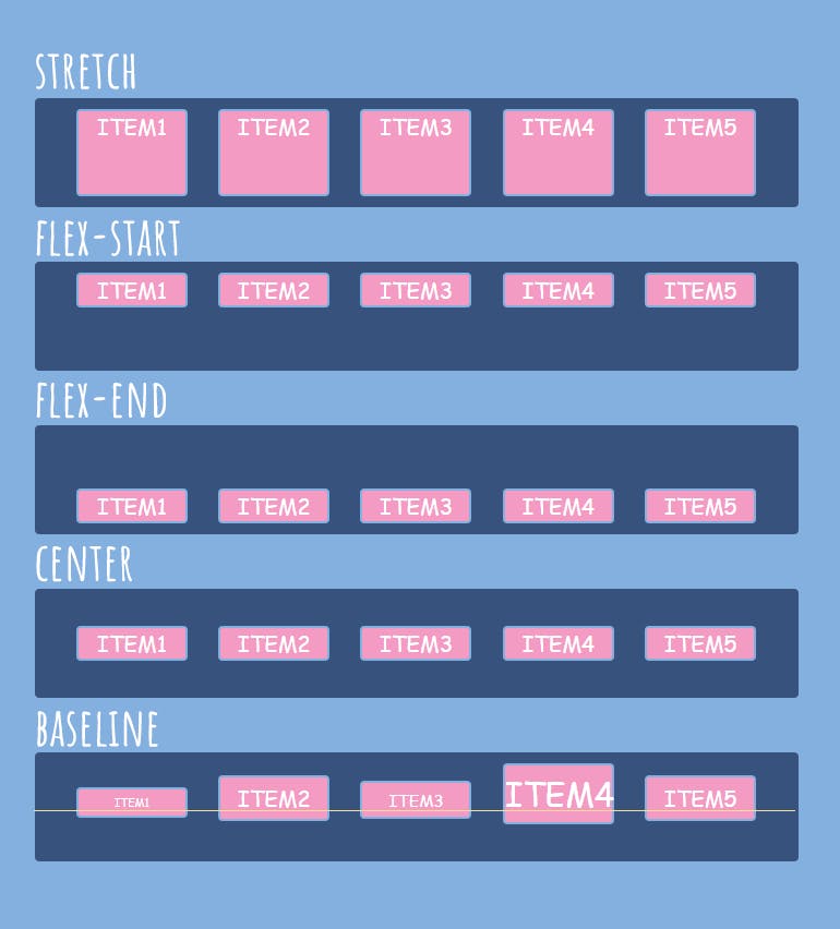
Align-items
Align-item property aligns items horizontally on the flex container. This property determines the default for how flex items get placed horizontally on each line. The following are the values of the align-item property:
Flex-start: The flex items are arranged at the top of the flex container.
Flex-end: The flex items are placed at the bottom of the flex container.
Center: The flex items are placed in the middle of the container.
Stretch: The flex items are stretched vertically to fill the container.
Baseline: The flex items align as their baseline aligns.
.flex-container{
display: flex;
align-items: flex-start | flex-end | center | stretch | baseline;
}
Perfect centering using CSS flex-box
Most people new to CSS always encounter problems when trying to center a div or a container. Centering a div is not rocket science. The easiest way to do this is to give the properties Justify-content and align-items a value of center.
.container{
    display: flex;
    justify-content: center;
    align-items: center;
}
Sizing and positioning associated with CSS flex items
The direct child element of the flex container is the flex item. In CSS, styling can be done on both the flex container and the flex items. This section enlightens us on the properties which only affect the individual item in the container.
This section can be further broken down into two distinct parts which are as follows
Sizing
Positioning
Sizing
in Sizing, the size of the flex item can be increased and decreased by using any of the following values
Flex-grow
Flex-shrink
Flex-basis
Flex
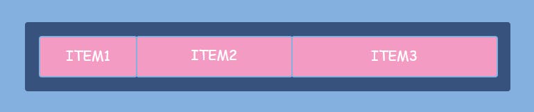
Flex-grow
This defines the ability for a flex item to grow if necessary. It accepts a unitless value that serves as a proportion for how much a flex item can grow. Flex-grow property determines how much a flex item will grow relative to the rest of the flex items.
<div class="flex-container">
  <div style="flex-grow: 1">ITEM1</div>
  <div style="flex-grow: 1">ITEM2</div>
  <div style="flex-grow: 2">ITEM3</div>
</div>

Flex-shrink
Flex-Shrink defines the ability of a flex item to shrink(reduce) in size relative to the rest of the flex items. The default value is 1. The value 0 allows the item to keep its original size.
<div class="flex-container">
  <div class='item1'style="flex-shrink: 3">ITEM1</div>
  <div style="flex-shrink: 2">ITEM2</div>
  <div style="flex-shrink: 1">ITEM3</div>
</div>
The flex-shrink value will not work if the container has the 'wrap' value set on the flex-wrap property
Flex-basis
Flex-basis defines the default size of an element before the remaining space is distributed. In a Flex row, the flex-basis does the same thing as the width. In a Flex column, flex basis does the same thing as height.
The value of the flex-basis can be set at length (e.g. 20%, 5rem, etc.) or a keyword which are
Auto: The auto keyword means “take my width or height property”
Content: The content keyword means “size it based on the item’s content”
.item1{
    flex-basis: <legth> | auto | content
}
Flex
Flex is the shorthand property for flex-grow, flex-shrink and flex-basis combined. The second and third parameters (flex-shrink and flex-basis) are optional. If you set the flex property with a single numeric value( like flex:5; ), that changes the flex-basis to 0%, so it’s like setting flex-grow:5, flex-shrink:1; and flex-basis: 0%(where 1 and 0% are the default values of flex-shrink and flex-basis respectively).
.item{
flex: flex-grow | flex-shrink | flex-basis
}
Positioning
positioning defines how the flex items can be positioned in the flex container. The position of the flex items can be adjusted using these two properties
Order
Align-self
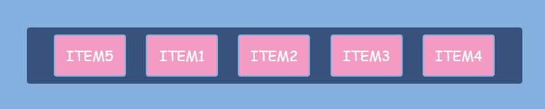
Order
Order property specifies the position of an item according to the order number assigned to them. when you stipulate the value -1 for an item, it pushes the item to the start of the container.
The default order for five flex-item is seen below

When 'order' is set at -1, the last item moves to the first position in the flex container
.item5{
  order: -1;
}
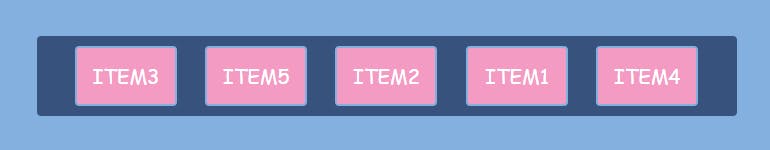
The flex items can be given different values so they can be arranged in the specified position assigned to them.
For example
 <div class='flex-container'>
  <div style="order: 4">1</div>
  <div style="order: 3">2</div>
  <div style="order: 1">3</div>
  <div style="order: 5">4</div>
  <div style="order: 2">5</div>
</div>
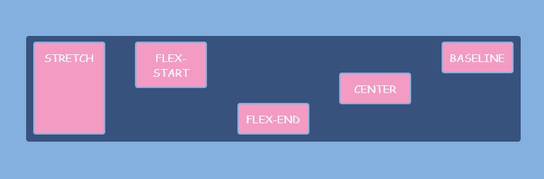
Align-self
Align-self determines how a single item is placed vertically in a flex container. Align-self property overrides the align-item property if previously stated.
The align-self property may have one of the following value
stretch: The item is stretched vertically to fill the container
flex-start: The item is positioned at the top of the flex-container
flex-end: The item is positioned at the bottom of the flex-container
Center: The item is placed at the center of the container
Baseline: The items are aligned as their baseline align
<div class="flex-container">
    <div style="align-self: stretch">stretch</div>
    <div style="align-self: flex-start">flex-start</div>
    <div style="align-self: flex-end">flex-end</div>
    <div style="align-self: center"> center</div>
    <div style="align-self: baseline">baseline</div>
</div>
Conclusion
CSS flexbox can be very convenient for positioning items in a flex container. From the information above, you'll be able to use the flexbox layout even as a complete beginner. The properties of the flex container and the flex item might confuse you once in a while. Read this flexbox documentation more than once and gain mastery over the flexbox layout.